Meow Meow Moon
Meow Meow Moon
Meow Meow Moon is a cozy cat café where you can enjoy great coffee surrounded by our favorite fluffy friends. I decided to go with a light meme style for the branding because cats are basically the kings of memes. The cat in the logo strikes the most popular meme poses - funny, relatable, and instantly smile-inducing.
The idea was to create a place that feels welcoming to cat lovers, coffee fans, and meme enthusiasts alike - a warm spot where humor and comfort come together
Meow Meow Moon is a cozy cat café where you can enjoy great coffee surrounded by our favorite fluffy friends. I decided to go with a light meme style for the branding because cats are basically the kings of memes. The cat in the logo strikes the most popular meme poses - funny, relatable, and instantly smile-inducing.
The idea was to create a place that feels welcoming to cat lovers, coffee fans, and meme enthusiasts alike - a warm spot where humor and comfort come together
How did this idea
come about
How did this idea
come about
The concept for Meow Meow Moon was born during a quiet morning at home. While enjoying a fresh cup of coffee, I noticed my two cats - Basya (pure white) and Nyusha (gray) - resting peacefully. The way Nyusha was lying, completely relaxed and content, brought a genuine smile to my face and sparked a simple but powerful thought:
What if we could create a brand that captures this warm, joyful feeling of sharing a peaceful moment with cats?
I wanted to go beyond typical cat-themed illustrations (paws, cartoon faces, whiskers). The goal was to build something more memorable, emotional, and unique. Initially, I considered a cat food brand, but when I looked at the coffee cup in my hands, the idea clicked: combine the cozy ritual of drinking coffee with the playful, comforting presence of cats.
This personal moment became the foundation of Meow Meow Moon - a cat café brand that blends comfort, humor, and everyday joy. The project started as a self-initiated idea with one clear mission: to turn a warm personal feeling into a complete visual identity and user experience
The concept for Meow Meow Moon was born during a quiet morning at home. While enjoying a fresh cup of coffee, I noticed my two cats - Basya (pure white) and Nyusha (gray) - resting peacefully. The way Nyusha was lying, completely relaxed and content, brought a genuine smile to my face and sparked a simple but powerful thought:
What if we could create a brand that captures this warm, joyful feeling of sharing a peaceful moment with cats?
I wanted to go beyond typical cat-themed illustrations (paws, cartoon faces, whiskers). The goal was to build something more memorable, emotional, and unique. Initially, I considered a cat food brand, but when I looked at the coffee cup in my hands, the idea clicked: combine the cozy ritual of drinking coffee with the playful, comforting presence of cats.
This personal moment became the foundation of Meow Meow Moon - a cat café brand that blends comfort, humor, and everyday joy. The project started as a self-initiated idea with one clear mission: to turn a warm personal feeling into a complete visual identity and user experience

The photograph that inspired this idea
The photograph that inspired this idea
Project Goals
Project Goals
The main goal was to create something truly memorable and joyful - a cat café that doesn’t look like all the others.
We’ve all seen the usual cat cafés: paws, cartoon cat faces, and endless “meow meow” everywhere.
I wanted to make a place where people could forget their worries for a moment. A brand that would make you smile the second you see the logo - warm, playful, and genuinely uplifting
The main goal was to create something truly memorable and joyful - a cat café that doesn’t look like all the others.
We’ve all seen the usual cat cafés: paws, cartoon cat faces, and endless “meow meow” everywhere.
I wanted to make a place where people could forget their worries for a moment. A brand that would make you smile the second you see the logo - warm, playful, and genuinely uplifting
Development stages
Development stages
Stage 1 - What does a person want?
Stage 1 - What does a person want?
Before jumping into design, I asked myself a simple question: “What does a person really want to see in a cat café?”
I surveyed about 30 people and the answer was surprisingly consistent. Most of them wanted something homey, cute, warm, and genuinely amusing - a place where they could come, relax, and spend time with friendly fluffy cats.
19 out of 32 people said almost the same thing.
That’s when I decided: a hand-drawn logo would fit perfectly. I took inspiration from the Japanese philosophy wabi-sabi - the beauty of imperfection. I didn’t try to make everything flawless. I drew it the way it felt right. And that’s exactly what gives the design its lively, heartfelt charm - perfect for a cozy cat café
Before jumping into design, I asked myself a simple question: “What does a person really want to see in a cat café?”
I surveyed about 30 people and the answer was surprisingly consistent. Most of them wanted something homey, cute, warm, and genuinely amusing - a place where they could come, relax, and spend time with friendly fluffy cats.
19 out of 32 people said almost the same thing.
That’s when I decided: a hand-drawn logo would fit perfectly. I took inspiration from the Japanese philosophy wabi-sabi - the beauty of imperfection. I didn’t try to make everything flawless. I drew it the way it felt right. And that’s exactly what gives the design its lively, heartfelt charm - perfect for a cozy cat café

First sketch
First sketch
Stage 2 - Moodboard & References
Stage 2 - Moodboard & References
One of the main references for this project was a small cat café in Saint Petersburg that I visited once and really fell in love with.
What struck me most was its incredibly home-like atmosphere. Even though the space was quite small and often full of people, it felt surprisingly clean, warm and welcoming. People were sitting on sofas with cats on their laps, playing board games at tables, or lying on the floor playing with the fluffies. You simply didn’t want to leave.
This visit helped me understand what people are really looking for in such a place - that cozy “home away from home” feeling.
I used this café as my main emotional reference while building the moodboard. The warm, lived-in atmosphere, soft lighting, and comfortable chaos inspired the overall direction of the project. The color palette I chose is similar in spirit - light, milky and gentle - though I made it a bit brighter and shifted it toward soft beige and yellow tones instead of green
One of the main references for this project was a small cat café in Saint Petersburg that I visited once and really fell in love with.
What struck me most was its incredibly home-like atmosphere. Even though the space was quite small and often full of people, it felt surprisingly clean, warm and welcoming. People were sitting on sofas with cats on their laps, playing board games at tables, or lying on the floor playing with the fluffies. You simply didn’t want to leave.
This visit helped me understand what people are really looking for in such a place - that cozy “home away from home” feeling.
I used this café as my main emotional reference while building the moodboard. The warm, lived-in atmosphere, soft lighting, and comfortable chaos inspired the overall direction of the project. The color palette I chose is similar in spirit - light, milky and gentle - though I made it a bit brighter and shifted it toward soft beige and yellow tones instead of green
Stage 3 - Color Palette
Stage 3 - Color Palette
After deciding on the overall design style, I started thinking about the colors for the brand.
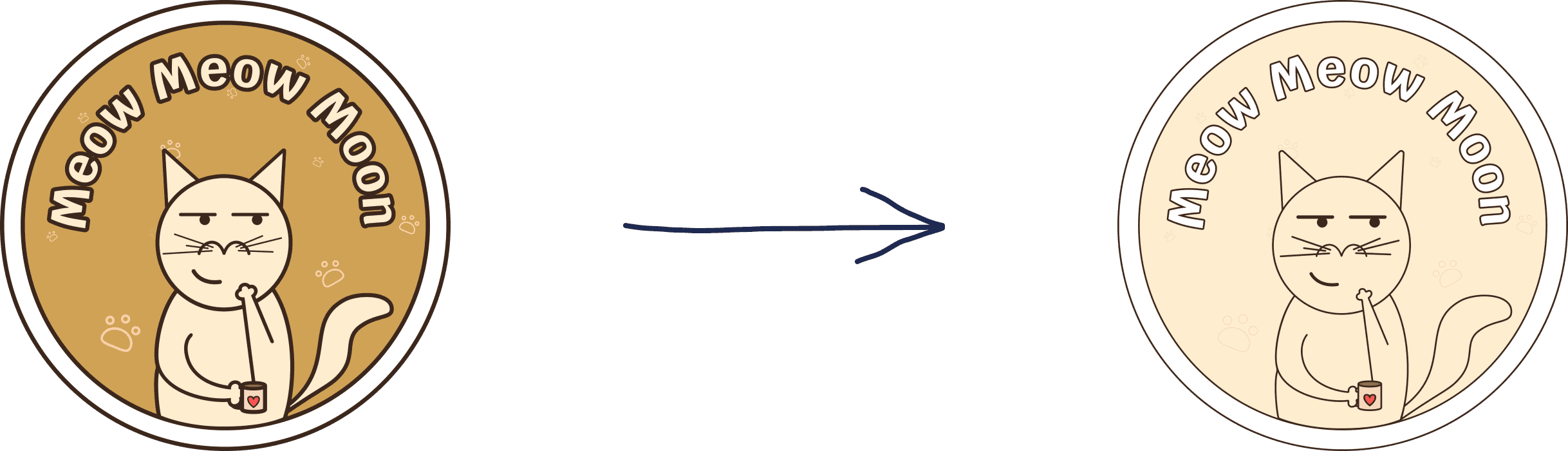
Since it’s a cat café where people mostly come for coffee and pastries, I thought coffee tones would fit perfectly. At first I chose darker shades: #3C271C for outlines, #D0A255 for the background, #FFEDCF as the main color, and #FFFFFF as an accent.
But after three days, I didn’t like it anymore - and neither did most of the people I showed it to. The logo looked heavy, messy, and unprofessional. I also realized I had used too many colors at once, which made everything feel cluttered. So I went back to thinking. I wanted the palette to be light, soft, and calm. Then the idea came to me: what if I make it in the style of milk coffee?
Milk (#FFEDCF) feels tender and cozy, while white (#FFFFFF) gives a sense of purity and order. I also made the lines much thinner to remove
the visual clutter.
When I showed the new version to people, they liked it way more. The logo immediately became cleaner, neater, and much more memorable. It finally felt right - warm, light, and inviting, just like the café should be
After deciding on the overall design style, I started thinking about the colors for the brand.
Since it’s a cat café where people mostly come for coffee and pastries, I thought coffee tones would fit perfectly. At first I chose darker shades: #3C271C for outlines, #D0A255 for the background, #FFEDCF as the main color, and #FFFFFF as an accent.
But after three days, I didn’t like it anymore - and neither did most of the people I showed it to. The logo looked heavy, messy, and unprofessional. I also realized I had used too many colors at once, which made everything feel cluttered. So I went back to thinking. I wanted the palette to be light, soft, and calm. Then the idea came to me: what if I make it in the style of milk coffee?
Milk (#FFEDCF) feels tender and cozy, while white (#FFFFFF) gives a sense of purity and order. I also made the lines much thinner to remove
the visual clutter.
When I showed the new version to people, they liked it way more. The logo immediately became cleaner, neater, and much more memorable. It finally felt right - warm, light, and inviting, just like the café should be
Before
Before
After
After
Stage 4 - Cat visual
Stage 4 - Cat visual
As I mentioned earlier, the whole concept was built around memes, so they had to appear in the branding somehow. I thought about this for almost two days. The idea finally came to me while I was scrolling through memes. What if I redraw popular memes, but replace the characters with our favorite fluffy cats?
I spent some time choosing memes that were based mostly on poses rather than specific personalities - this way I wouldn’t run into copyright issues. Then I started drawing cats in those funny, recognizable positions.
When I showed the first sketches to people, they immediately started smiling and laughing. Many said the idea was really fun and fresh. It felt like I was on the right track - the cats looked playful, relatable, and full of character
As I mentioned earlier, the whole concept was built around memes, so they had to appear in the branding somehow. I thought about this for almost two days. The idea finally came to me while I was scrolling through memes. What if I redraw popular memes, but replace the characters with our favorite fluffy cats?
I spent some time choosing memes that were based mostly on poses rather than specific personalities - this way I wouldn’t run into copyright issues. Then I started drawing cats in those funny, recognizable positions.
When I showed the first sketches to people, they immediately started smiling and laughing. Many said the idea was really fun and fresh. It felt like I was on the right track - the cats looked playful, relatable, and full of character


Stage 5 - Logo and branding elements
Stage 5 - Logo and branding elements
At the beginning, the logo was much simpler - just a cat’s face and
the name of the café. It felt too plain and didn’t clearly communicate
that this was a cat café.
I decided to redesign it. First, I placed the cat inside a circle, trying to make it look like it was sitting in a coffee cup. But it still seemed too basic. While scrolling through memes, I got a new idea: what if the cat
was holding a cup of coffee?
In the first attempt, the cat held the cup with its back paw, which looked strange and unclear. Then my friends suggested a better solution - replace the awkward paw with a tail, and let the cat hold the cup naturally with its front paw. That was the moment everything clicked.
The final logo shows a cute cat sitting inside a large coffee mug while holding another mug of hot coffee. The dark brown outline (#3C271C) creates the nice illusion that the cat is drawn with chocolate on milky foam.
To check if the idea worked, I showed the logo to about 50 people. More than half immediately associated it with a café. Some thought it was cocoa or tea, but almost everyone understood it was related to a cozy drink spot. The logo turned out to be memorable, friendly, and instantly readable - exactly what I wanted
At the beginning, the logo was much simpler - just a cat’s face and the name of the café. It felt too plain and didn’t clearly communicate that this was a cat café.
I decided to redesign it. First, I placed the cat inside
a circle, trying to make it look like it was sitting in a coffee cup. But it still seemed too basic. While scrolling through memes, I got a new idea: what if the cat was holding a cup of coffee?
In the first attempt, the cat held the cup with its back paw, which looked strange and unclear. Then my friends suggested a better solution - replace the awkward paw with a tail, and let the cat hold the cup naturally with its front paw. That was the moment everything clicked.
The final logo shows a cute cat sitting inside a large coffee mug while holding another mug of hot coffee. The dark brown outline (#3C271C) creates the nice illusion that
the cat is drawn with chocolate on milky foam.
To check if the idea worked, I showed the logo to about 50 people. More than half immediately associated it with
a café. Some thought it was cocoa or tea, but almost everyone understood it was related to a cozy drink spot. The logo turned out to be memorable, friendly, and instantly readable - exactly what I wanted

The meme that inspired me
The meme that inspired me
Result
Result
In the end, I can say that I achieved exactly what I set out to do.
The logo and overall identity turned out warm, playful, and memorable - just the way I imagined them. Most importantly, when I showed the project to people, they genuinely smiled and really liked it. That reaction means the most to me.
This project took me about 8 months - from research and moodboarding to countless iterations and final touches. Even though it was a long journey, I’m very satisfied with the result. I still have ideas for further development and plan to keep adding new elements to this brand in the future.
Thank you so much for taking the time to look through my work. I really appreciate it :)
In the end, I can say that I achieved exactly what I set out to do.
The logo and overall identity turned out warm, playful, and memorable - just the way I imagined them. Most importantly, when I showed the project to people, they genuinely smiled and really liked it. That reaction means the most to me.
This project took me about 8 months - from research and moodboarding to countless iterations and final touches. Even though it was a long journey, I’m very satisfied with the result. I still have ideas for further development and plan to keep adding new elements to this brand in the future.
Thank you so much for taking the time to look through my work. I really appreciate it :)


Contacts
Contacts
Ready to talk?
Ready to talk?
Tell me about your idea, project, and we will definitely discuss it's implementation!
Contact me by email - merkin.karter@gmail.com
Tell me about your idea, project, and we will definitely discuss it's implementation!
Contact me by email - merkin.karter@gmail.com
Silent Collective
I create websites that don’t just look good - they actually work well for real people. I stay with every project long after launch, providing ongoing technical support.
And if needed, I bring reliable frontend developers on board to make sure everything runs smoothly
I create websites that don’t just look good - they actually work well for real people. I stay with every project long after launch, providing ongoing technical support.
And if needed, I bring reliable frontend developers on board to make sure everything runs smoothly
© 2026 Silent Collective. All rights reserved.
The website was made with love
© 2026 Silent Collective. All rights reserved.
The website was made with love